…said the lady behind the desk of the antiques centre I was in as I plonked it in front of the till. Perhaps she was right. It wasn’t a shape I immediately recognised, and it had a cut and polished scooped rim that I’d usually associate with Scandinavian makers. Still, even if it was a piece of Orrefors or something, £10 didn’t seem bad at all. There was something about the colour though, I could swear it was Whitefriars.
 After handing over my crisp tenner, I drove home mulling it over. Did I really need another vase, especially one that I only ‘quite’ liked? Also, I don’t collect Whitefriars anyway, even if I am right about the colour and the characteristic nicely polished concave pontil mark.
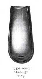
Books are an invaluable thing. Within seconds of flipping through Lesley Jackson’s excellent tome, I found it. I was right. It doesn’t look much, especially if you prefer something more jazzy and colourful. Designed in 1957 by Geoffrey Baxter, it represents both the popularity of Scandinavian glass at the time, and the influence that this glass had on his designs. No doubt Baxter thought that if people wanted fashionable Scandinavian glass, why not produce a British version that was inspired by it? He wasn’t alone, both Frank Thrower at Dartington Glass and Ronald Stennett-Willson at King’s Lynn Glass were thinking along the same lines. Even the austere ‘Ocean Green’ colour echoes Scandinavian designs. First appearing in the landmark 1957 catalogue, and made until 1962, it’s not a common shape. By courtesy of the excellent Whitefriars.com, you can see the shape as appeared in the 1957 catalogue (above), together with its model number, 9491, and it’s height, below. I must remember to trust my instincts more often. Given this attribution, and the popularity of Whitefriars, I’d see it fetching over £70 if it sold to the right person.
0 thoughts on “It doesn’t look like Whitefriars to me…”
Leave a Reply
You must be logged in to post a comment.


http://www.bathmateus.com
I like it !!!
Good posting !!!
Nice posting !!!