
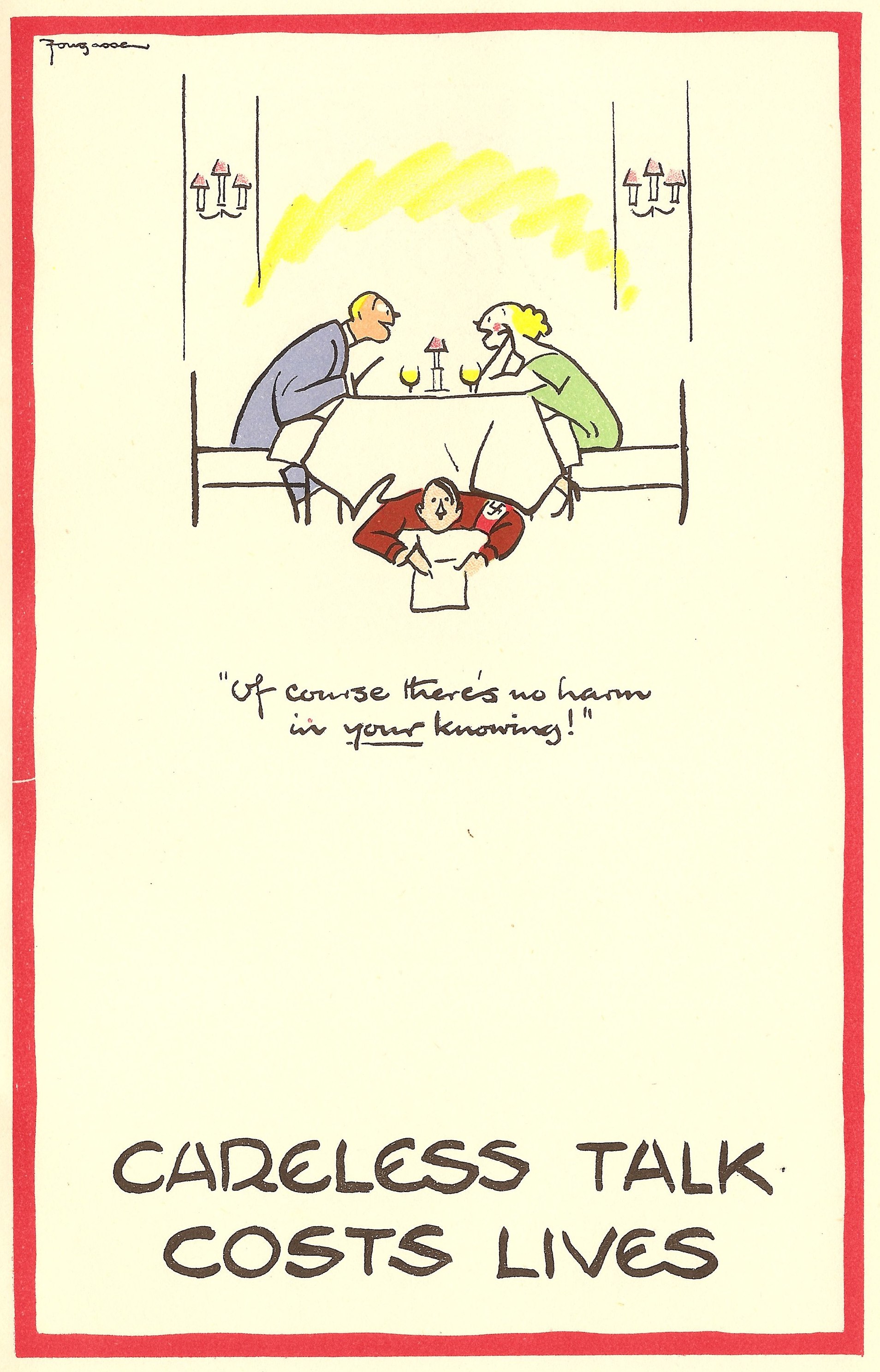
 Artist and caricaturist Fougasse is best known for his iconic ‘Careless Talk Costs Lives‘ posters, produced during World War Two to caution the public against gossiping and accidentally spreading information that may be of use to German spies during the War.
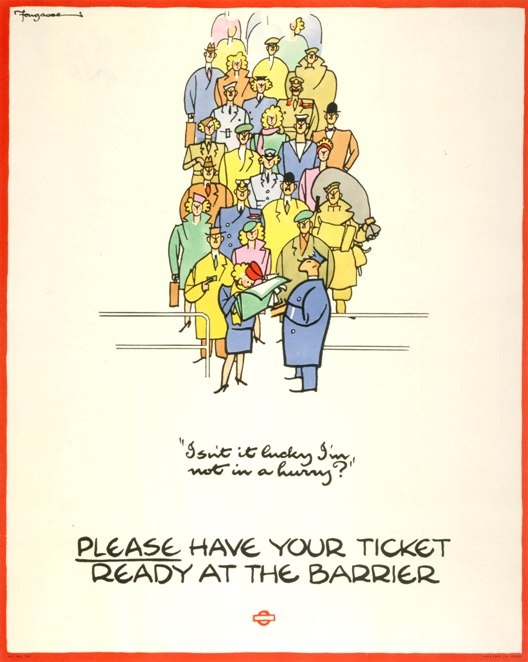
Fougasse was the pseudonym of Cyril Kenneth Bird (1887-1965), a qualified civil engineer, who turned to drawing while convalescing after suffering serious wounds at Gallipoli during World War One. He chose the name as it was the bread-derived nickname of a French landmine, the effectiveness of which was “not always reliable, and its aim uncertain“. Adopting a quirky, almost sparse, style laden with quintessentially British humour, he was successful and became one of the best known cartoonists of the day. As well as illustrating various books, he contributed to Punch, The Graphic and Tatler, and was editor of Punch from 1937-49. During World War Two, he worked for free producing poster designs for the Ministry of Information, including the ‘Careless Talk Cost Lives‘ series, where each design contains a ‘hidden’ Hitler and/or Goering, listening in to potentially valuable tittle-tattle. His much-loved and popular work earned him a C.B.E. in 1946.
 Browsing around the excellent Bloomsbury Ephemera Fair on other business this weekend, I found another example of his work – instantly recognisable from the orange border, choice of colours and witty, minimal style. The thing was, I hadn’t seen it before – ever. And nor had the dealer selling it. Fougasse’s work has been much reproduced, but this was clearly an original judging by the understandably poor quality paper it was printed on and the slight discolouration, despite being in such good condition. The subject matter was design, and what constitutes good design and, judging from the content, it dates from 1946. Of course, I couldn’t leave it behind…especially for £25.
Titled ‘Accident or Design?’, it’s a simple pamphlet issued by the Council of Industrial Design (The C.O.I.D.) in 1946, possibly in conjunction with the legendary ‘Britain Can Make It‘ exhibition held in the same year. The COID was founded by Royal Charter by the British Board of Trade two years earlier in 1944 to revive and promote inclusive British industry and design, and is known today as the Design Council. Its stated mission is and always has been “to champion great design that improves lives and makes things better“.
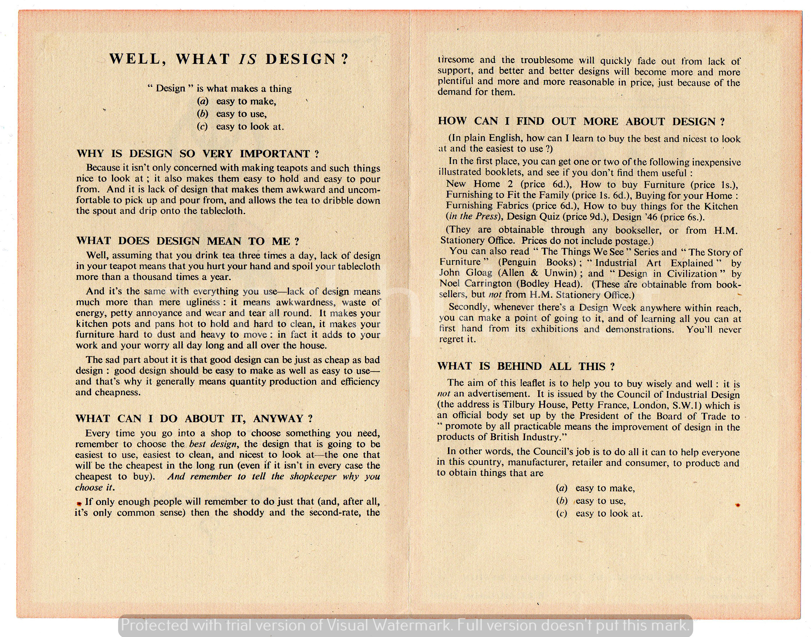
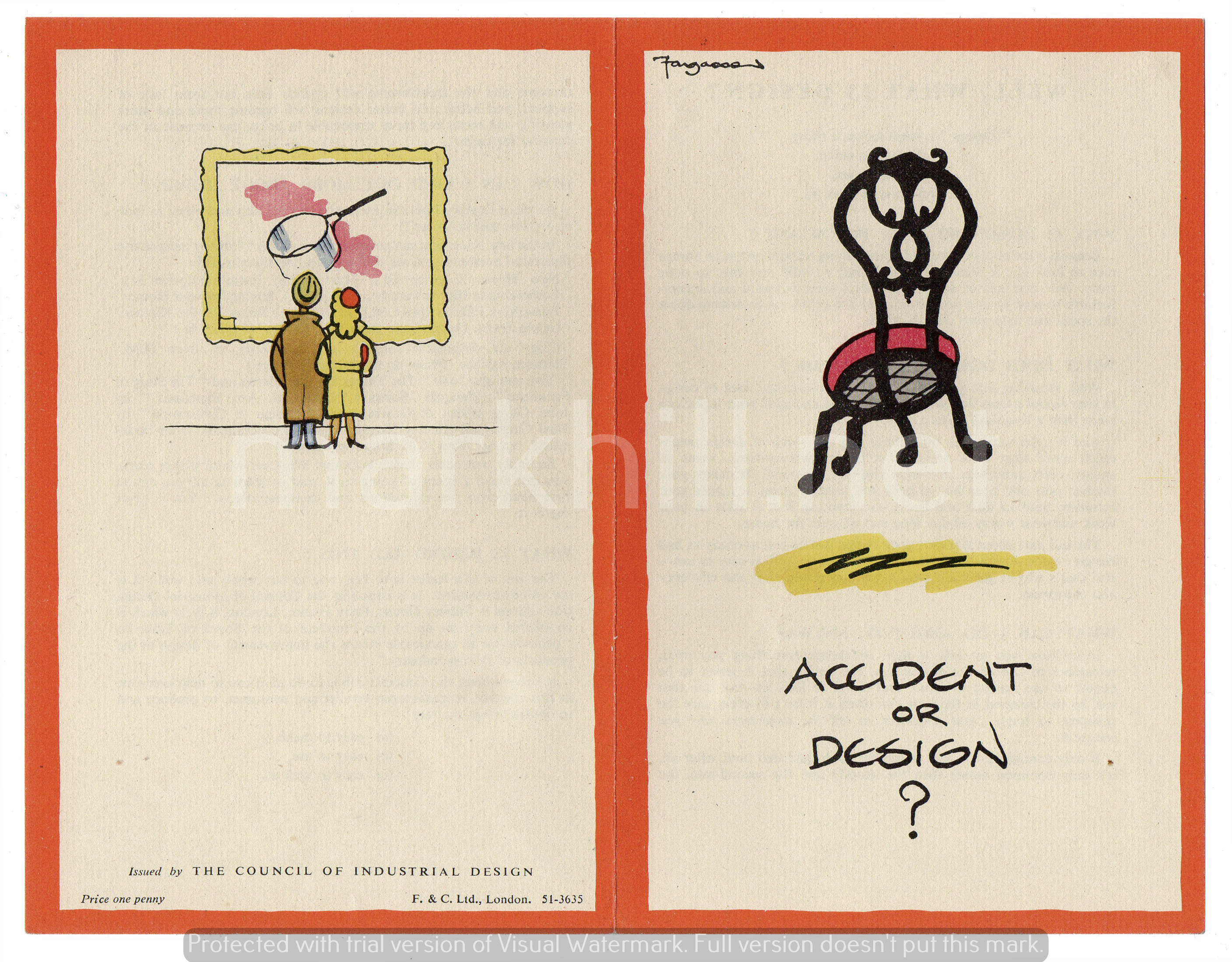 And that’s exactly what this pamphlet does. The front page questions whether a chair (the decorative back of which forms an ‘interested’ face looking down at the title) is the way it is because of an accident, or because of intended design. The back page shows two people in a gallery looking at a picture in an ornate gilt frame – except the ‘art’ is a saucepan. Can a mundane saucepan be art? The inside explains in simple terms what design is, why it is important, what it means to the reader, and gives tips on how to find out more about (good) design by reading books and looking at a copy of Design Week magazine. It also encourages the reader to consider good design and to seek it out and buy it. It points out that the aim of the leaflet is “…to help you buy well and wisely.” Brilliant – buy good British design and help yourself as well as the country in its time of reconstruction following the war.
 A quick Google search when I got home revealed no information on, or images of, the leaflet, which is highly unusual. I know it’s very rare, but I’m now not sure quite how rare. Looking at the bottom of the back page, I noticed that this leaflet wasn’t given away, but was sold for one penny, which is roughly equivalent to 20 pence today. I wonder how many of these very simple marketing leaflets were printed, how many were actually sold and, moreover, how many were kept for the past seven or so decades?
Whatever, I’m delighted with it. I’ve always liked Fougasse’s work, especially after filming a set of the aforementioned posters on the BBC Antiques Roadshow in Manchester some years ago, and the subject matter of design at a turning point of emerging British mid-century design is right up my street.
Please note the distinctive orange colour used by Fougasse for borders may appear different on certain types of screen. The original document has the correct tone, as is to be expected. Apologies for the watermark and the trial software mark which has been deliberately left in. I don’t want this image to be copied and used everywhere, but I do want people to be able to see it on my website!