
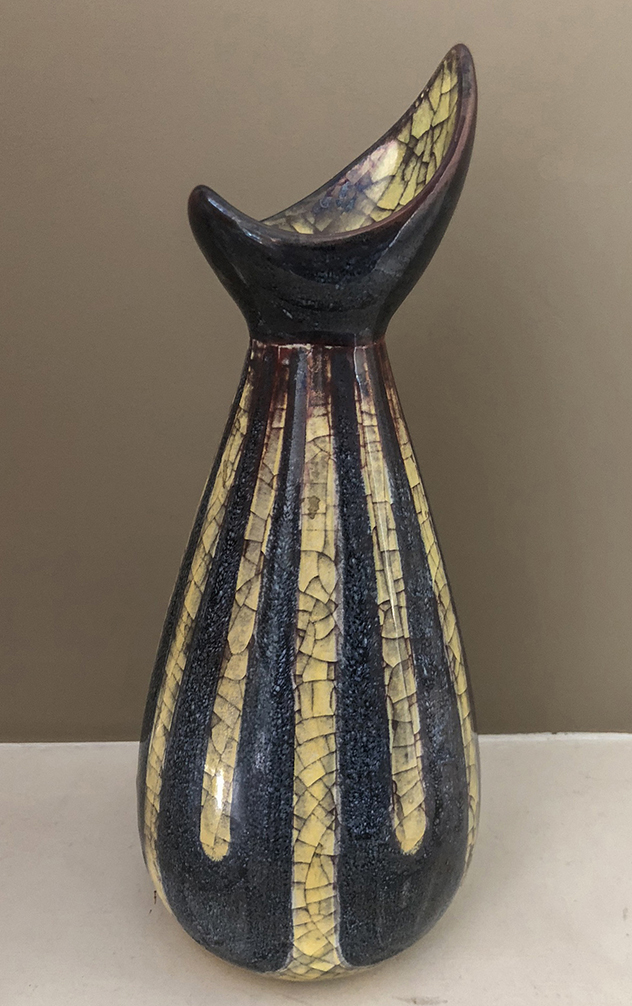
 When I attend the Antiques For Everyone fairs in Birmingham, or the Art, Antiques & Interiors Fair in London’s ExCel, I generally tend to give a short afternoon talk. In these, I always say that these fairs are great places to buy – which they are. I believe in practising what I preach, so I always buy at least one thing without fail. For the second year running, my ‘Object of The Fair’ came from the amazing display put on by Lyn and Wayne of Lynways. Specialists in Scandiavian mid-century modern design, their stand is always bursting with great design and objects to attract and delight the eye and mind, from ceramics to glass to metalware. This year, it was a late 1950s curving vase with a curious glaze decor by Danish pottery Michael Andersen & Sons that spoke to me so much that I simply couldn’t leave it behind.
Michael Andersen & Sons were founded in 1890 by Jens Michael Andersen (1859-1931) out of an existing pottery that had been founded in 1773 in the town of Rønne on the island of Bornholm. Compared to other Danish, and indeed Scandivian ceramics companies, such as Rorstrand or Arabia, they are largely ignored. This is surprising, as their production is typically of excellent quality both in terms of manufacture and design. It was thriving by the 1930s and, under the ownership of his two sons, it employed over 70 people during the 1940s & 50s. The company is still producing today, having been taken over by the artist Solveig Ussing in 1993. Before buying it, Ussing had worked for the company since she was 14 years old!
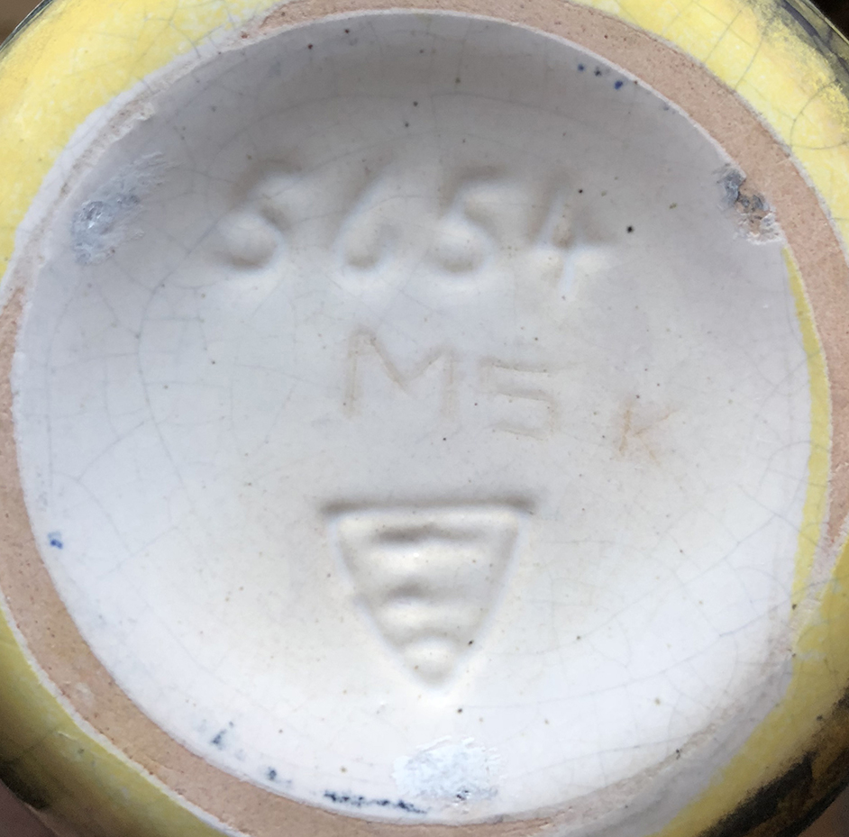 The marks on the base are helpful. The shield containing three fish indicates the pottery and was used from 1931. The fish are herrings, and this is the arms of the town of Rønne, where the pottery is located. The impressed 5654 indicates the shape number. The impressed ‘K’ probably indicates the decorator who applied rthe pattern and glaze. The inscribed ‘MS’ shows that the design was produced by Marianne Starck (1938-2007), who was educated at the School of Fine Arts in Hamburg and joined the company as Art Director in 1955. Remaining there until 1993, she is perhaps best known for the black and white stylised ‘Negro’ designs as well as her work with the Persia glaze.
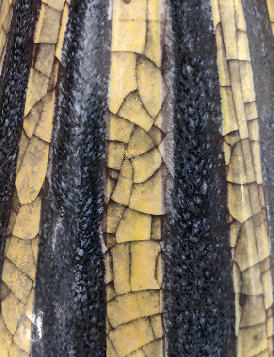 And it’s that complexly crackled glaze that really caught my eye. The Persia glaze was created in the early-1930s by Daniel Folkmann Andersen (1885-1959), the eldest son of the founder. At the World’s Fair in Brussels in 1935, it was awarded a Gold Medal, and it was used into the 1960s. It is said that the glaze formula and technique used were kept highly secret and have now been lost and forgotten, so the Persia glaze can never be produced again. It was used for both abstract and figural designs, with the latter echoing the designs of Stig Lindberg and, to a certain extent, fellow Danish designer Bjorn Wiinblad. Figural designs tend to be more popular with collectors, and typically more valuable (at £150-600 or so), but I think this hallmark glaze works best on simple abstract or geometric patterns. With these, the high quality of the glaze is allowed to express itself over and above anything that may detract from it, such as figural fuss and any expression of emotion or personality therein.
Furthermore, I think that with this (10.25in/26cm high) example, the pattern and form work seamlessly in harmony. The curving tapering U’s of the muted mottled green/grey glaze echo the tapering curve of the main body and the curves of the asymmetric, concave rim. They contrast against the verticals of the U forms, and the many fine angular craquelure lines that are the hallmark of the Persia glaze.
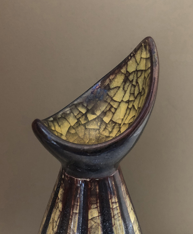 So it’s not just the glaze that works for me here, it’s the form. This sums up the 1950s natural inspiration behind the Scandinavian Modern style perfectly, with its bud-like and leaf-like form. There are no straight lines in nature. To me, it’s the ceramic version of Per Lütken’s ‘Naebvase’, designed in 1955 for Holmegaard.
It’s a stunning, sumptuous, evocative, and rare piece that rewards from whichever angle it’s viewed and captures the period perfectly. It made an ideal prop for one aspect of my informal talks at this year’s event, and I know I’ll love it for years to come. I wonder what I will buy next time?!
See where Lynways are next by visiting their website, or following them on Twitter.