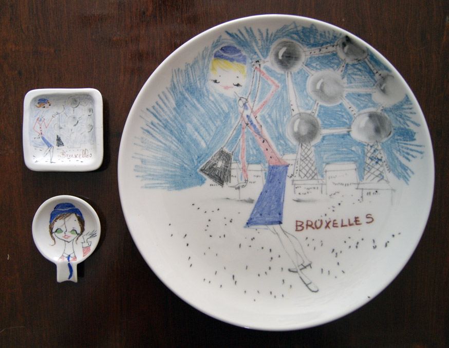
Those of you who have bought Alla Moda, my new book on mid-century Italian ceramics, will have seen a double page spread of quirky ceramics by an as yet unknown company and designer who ‘signs’ each piece with a stylised four petalled flower. I’ve pretty much fallen in love with them!
At the Midcentury Fair last weekend, Haji & White were on the stand next to me. One of their favourite areas is the 1958 Brussels Exposition, or World’s Fair, which was an important showcase of postwar design and industry. Amidst the brochures, models of the Atomium, and posters, I was delighted to spot three ceramics by The Flower Painter, a large wall charger, a small square dish, and a ‘one-person’ tiny ashtray. Each shows the famously friendly hostesses that helped visitors to the park and pavilions. A price for the three pieces was worked out, and I added them to my collection. Although they still don’t reveal the identity of the maker or designer, I have learnt a number of new things from these ceramics:
- The pottery was in existence before 1957, when it would have won a commission to produce souvenirs for the Exposition.
- It had a trade presence outside Italy, either in its own right, or via a distributor.
- It was large enough to be considered by the committee of an international Exposition and trusted to fulfill an order placed.
- It was large enough to be able to produce a wide range of individually hand-decorated ceramics from large wall chargers down to tiny ashtrays, or sub-contract some of that work elsewhere.
- The letter of the painted characters on the base usually indicates the shape, V for vase, P for plate, A.T. for ashtray.
We’re still not much closer to finding the identity of the pottery or designer, and even top experts in Italy don’t know. All we really need is for a catalogue or an example with a maker’s (not distributors’) label to be found. Get hunting, I certainly am!

Update: Thank you to those who kindly contacted me over the past few weeks to say that the designs are very similar to Zucchi of Milan tea towels and a cheese board by a designer called ‘Milvia’.
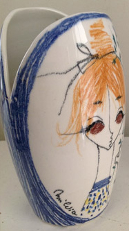
 I can certainly see the similarity in the overall style and choice and tone of the colours, but there are still differences. For example, many Flower Painter faces have lines showing the nose and mouth that work both fully frontal, and also as profiles. It’s quite clever, and even echoes Picasso. Milvia designs don’t seem to have this. Why change it? There could be good reason, particularly as the tea towels seem to date from 15-20 years later, when the company may have become larger and designs looser and easier to print. More interestingly, HiandLo Modern in the US recently sold a ‘Flower Painter’ vase which appears to be signed ‘Milvia’ (right).
I’ve learned not to trust such signatures on Italian pottery of the period, as they were usually added to make a piece look ‘artist-signed’ and thus add value, rather than to indicate the actual artist or designer. Signatures on ceramics from San Marino are particularly applicable here. But any more information about Milvia – who are the leading candidate for the identity of the Flower Painter to date – will be much-appreciated. Thank you!

